
Using Photoshop Layers to Create a Photoshop Collage

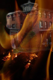
Step 2 (BELOW)- More flames, stretched large, with the opacity adjusted to 85% and the fill to 68%.
The opacity and fill can be adjusted individually for each Photoshop layer using the controls at the top of the Layers box. 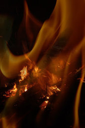
Step 4 - In Step 4 (BELOW) I've added some atmosphere using a spectacular Joyful Expressions sunset photo with red clouds and a slice of moon covering part of the building.
By layering it over the apartment building, I've begun to create an eerie surrealism that reflectsthe mood present throughout most of FUEL FOR THE FIRE. 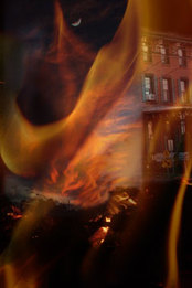
Step 6 - With Photoshop layer #6 (BELOW), I've added a distressed child reaching out for help. To highlight her for this lesson, I've circled Lora (the little girl) as I have intentionally reduced her opacity to 87% and the fill to 81% to symbolically illustrate that she is lost throughout most of the novel. 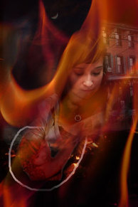
Step 8 (BELOW) - A spider faintly hovers over the child's head (Opacity 44%; fill 68%).
Representing danger to the child, the spider is also an illustration of the twisted tentacles (Yes, I know spiders have legs, not tentacles!) squeezing the characters, and keeping readers on the edges of their seats. 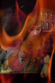
|
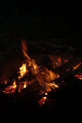
Step 1 - I chose a campfire as the first Photoshop layer because fire was to be prominent on the book cover to reflect the title, FUEL FOR THE FIRE.
Step 3 - In Step 3 (BELOW) I added a brick building to represent the apartment home of the main characters.
Step 5 - Finally, with the introduction of the protagonist, Janisa, the cover is really a Photoshop collage.
(Since I am a graphic artist, and not a sketch book artist, I have utilized photographs of real places and people. Be sure you have permission and/or 'model' releases for commercial use of photos of people.) 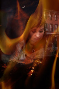
Step 7 - For Layer 7 (BELOW), I've added a Barn in the left bottom, and a young man in the bottom right corner.
The Barn represents an occult commune prominent in the concluding chapters. The young man represents, Cat, the gang banger brother of the lead character partially instrumental in solving the mystery around the missing child. 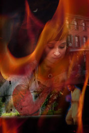
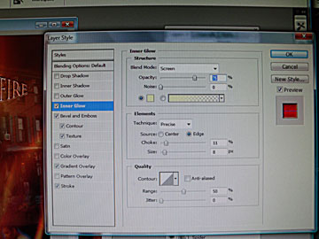
Step 9 (BELOW) - Finally: the title, FUEL FOR THE FIRE. Simple, right? Wrong! The title is as critical to appearance and appeal as the other graphics. Here are most of the decisions I made before I was satisfied with the font. Font: Trajan Pro, 24 pt Regular Sharp Color: c2b7b7 Warp Text: Bulge Horizontal, Bend +50 Blending Options: Inner Glow 75% Precise; Color ffffbe; Bevel & Emboss - Pillow Emboss, Chisel hard contoured; Gradient Overlay - Textured, Normal Reflected 90 @ 109%;Stroke - Size 6, Outside Normal, 100% opacity, Color 6d0a0a This will give you some idea of what goes into graphic artists' costs! 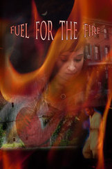
|
Step 10 - As you can see by the image of the cover on the right, I decided to change the appearance of my protagonist, Janisa, from an actual person to a fictional one. I used filters, cloning, brushing and erasing to create the new image. I also replaced the child with a front view of a little girl in distress. And, at the suggestion of David Roth, a professional book-reviewer, I straightened the title. Step 11 - The last step is a Photoshop layer with the author's name (me) at the bottom which I laid over the image of a knife, and another layer with the tickler (the sizzle to hopefully entice the reader) at the top. Here are the fonts I used: Author: Elizabeth Phillips Goehringer - Tempus Sans ITC 24 pt Regular Strong Finally: I redid the colors with CMYK (from RGB which offers more creative options) per the publisher's requirement and created a more somber tonality. |
To the left is a one of the several tweaks I made to the title Photoshop layer through Blending Options (accessed by right clicking on the layer you want to adjust). 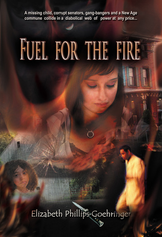
|
Tickler: "A missing child, corrupt Senators, gang bangers, and a New Age commune weave an intricate plot of power at any price..." - Ariel Narrow 14 pt Bold Strong
To learn how the Photoshop Layers reflect the plot of Fuel For The Fire, CLICK HERE for the meaning of Cover Image Symbols.
CLICK HERE FOR SIMPLE DIRECTIONS FOR A BEAUTIFUL WEDDING COLLAGE.
To learn how the Photoshop Layers reflect the plot of Fuel For The Fire, CLICK HERE for the meaning of Cover Image Symbols.
CLICK HERE FOR SIMPLE DIRECTIONS FOR A BEAUTIFUL WEDDING COLLAGE.